Think back to an old family kitchen, the one that belonged to a grandmother or a great aunt. What most people remember is the light version: floral curtains, painted cupboards, a tablecloth with a pattern, a windowsill full of small glass jars. That’s the picture that grandma-core sells, and it’s lovely.
But those kitchens had another face, and it showed up around five in the afternoon in November. The overhead light stayed off because it was too harsh. A lamp came on in the corner instead, the wood went from brown to almost black, the copper pans on the wall caught the last of the daylight, and the whole room turned quiet and deep. That second version is what a dark cottagecore kitchen is chasing, and it’s the version I’d build today.
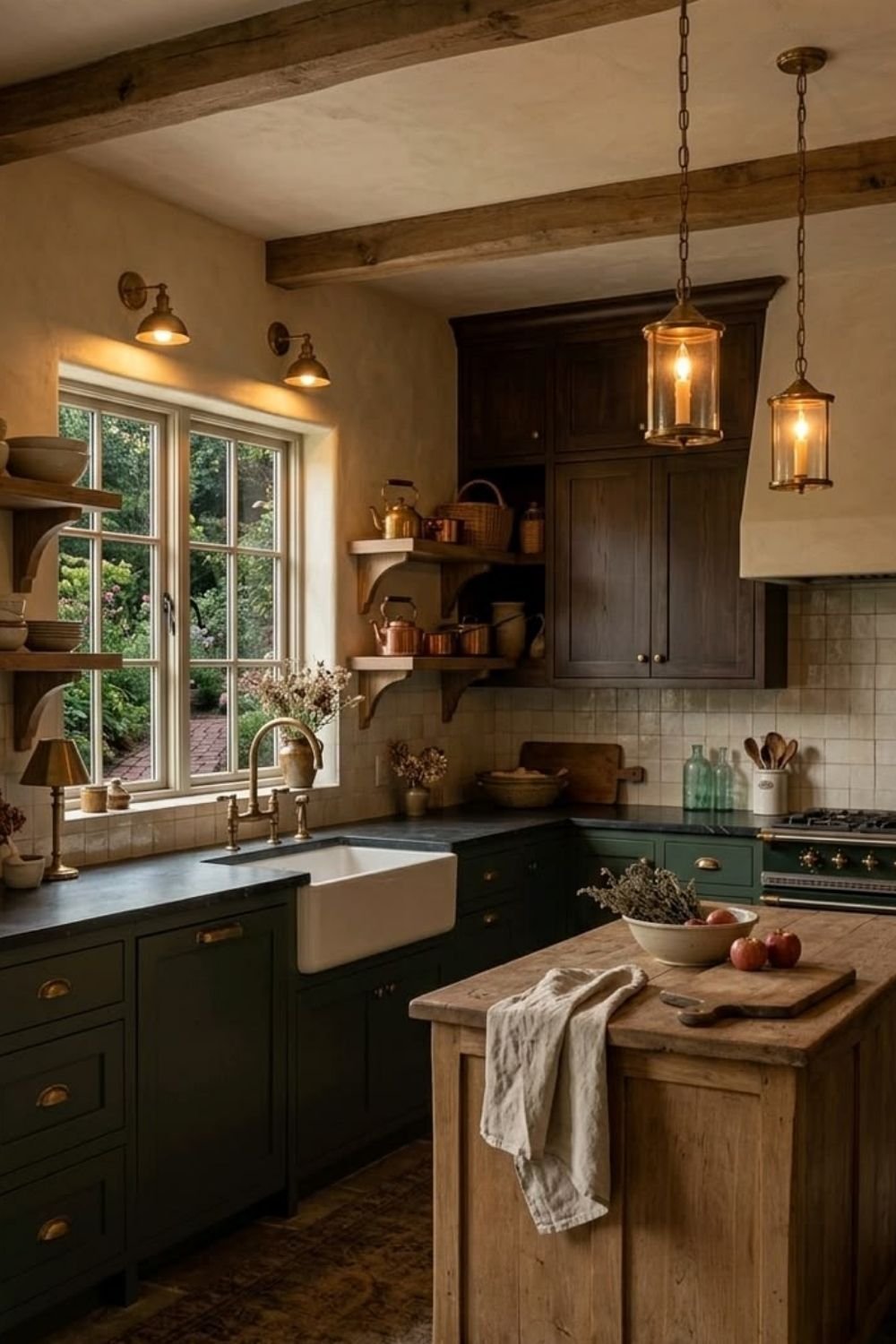
Photo by OurHoneyHome
The kitchen above is the whole idea in one photo. Deep green cabinets with brass cup pulls sit under a soapstone counter and a white farmhouse sink, exposed beams cross a plaster ceiling, and two glass lanterns hang over a rough wood island with a bowl of apples and a bunch of drying herbs on it. Open shelves hold copper kettles and a wicker basket, a small brass lamp glows on the windowsill next to a jug of pink flowers, and the light is all coming from the window and a few warm bulbs. Nothing in it is new, and nothing in it is precious.
What follows is how a dark cottagecore kitchen is put together, from the paint to the objects, and how much of it you can do in a rental or a small galley kitchen.
What makes it dark, and what keeps it cottage
The difference between classic grandma-core and this is mostly a swap of pattern for material. Where the light version leans on floral prints, painted checks and pale wood, the dark version gets its interest from texture and shadow: the grain of an old table, the dull sheen of an aged brass tap, the matte depth of a deep green cabinet, a stone wall that isn’t quite flat anywhere.
What carries over is everything that makes a kitchen feel lived in rather than installed. Mismatched crockery, the cast iron pan that’s older than you are, the enamel jug that holds wooden spoons, a tablecloth, a plate propped against the backsplash. Those objects are the cottage part, and without them a dark kitchen turns into a very handsome showroom.
My rule of thumb is that anything functional can be old and worn, and anything decorative should be small. A dark kitchen has less visual room than a white one, so ten little things scattered around look like clutter, while three larger ones look composed. That’s the main adjustment people have to make when they go from a bright vintage kitchen aesthetic to this one.
The color, and how far to take it
In cottagecore kitchen ideas of this kind, deep green is the easiest starting point because it behaves like a neutral against wood and brass, and it reads as countryside rather than as drama. Olive, sage-gone-dark, forest and a green with a lot of gray in it all work, and they cope well with the yellow cast of warm bulbs, which is not true of every color.
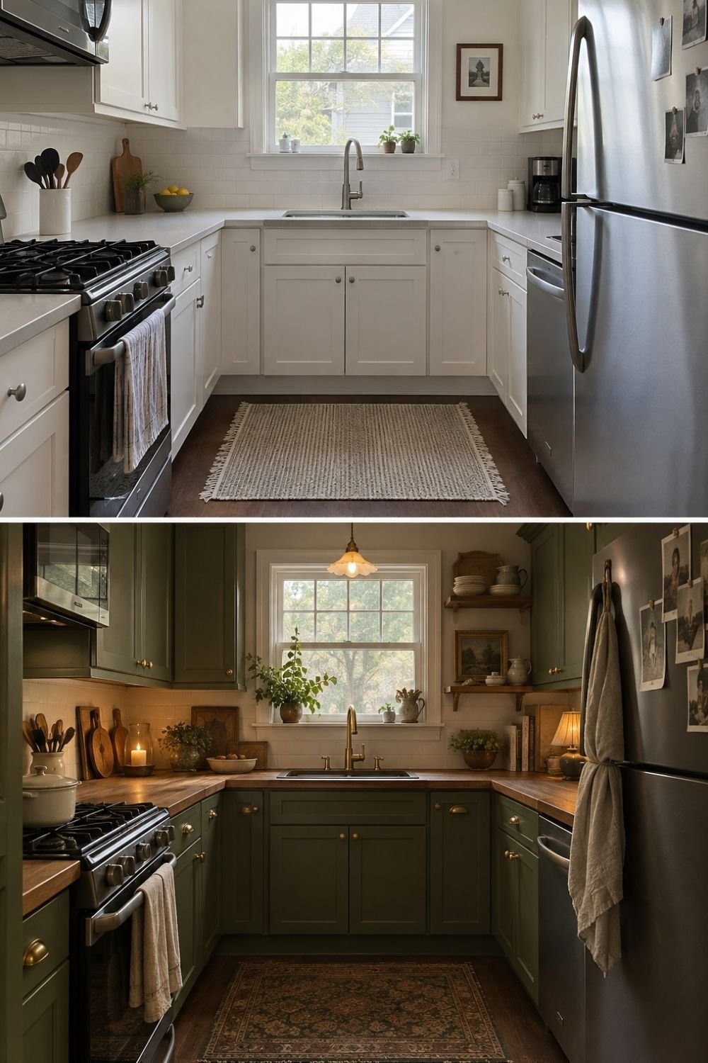
Photo by OurHoneyHome
The before-and-after above shows how much of the work paint does on its own. In the top frame it’s a small U-shaped kitchen with white shaker cabinets, a white counter, a white subway backsplash, a stainless sink and a plain woven rug: perfectly nice and completely anonymous. In the bottom frame the same cabinets are olive green, the counters are butcher block, a pleated glass pendant hangs where the ceiling fixture was, two wood shelves hold cream crockery and a little framed landscape, and there’s a candle burning on the counter, a plant in the window and a faded Persian-style runner on the floor. Same layout, same appliances, same window.
If full green feels like too much, the half-and-half approach is safer and often looks better: dark cabinets below, lighter walls and shelves above, with the ceiling left pale so the room keeps its height. Plum, deep brown and near-black all work the same way. What I’d avoid is painting a small kitchen dark on every surface including the ceiling, because at night it stops feeling warm and starts feeling like a basement.
Wood, stone and metal that have been used
Once the color is settled, the materials do the rest. This look wants surfaces with some age in them: butcher block that’s been oiled and scratched, a slab of stone with visible tool marks, terracotta, unglazed pottery, a plastered wall that isn’t perfectly smooth.
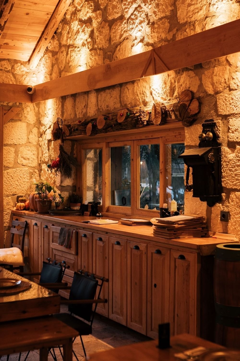
Photo by Faruk Tokluoğlu on Pexels
The kitchen above leans almost entirely on materials rather than color. A rough limestone wall runs the length of the room, lit from below so every stone casts its own shadow, with pale timber beams and a plank ceiling above. Simple pine cabinets with black cup handles sit under a thick wood counter, there’s a bunch of drying herbs hanging on the wall, small pumpkins and a potted plant at one end, and an antique black wall telephone that nobody has taken down. The warmth is doing the same job that deep paint does elsewhere.
Brass and copper matter here more than they sound like they should. A brass tap, copper pans on a rail, an old brass candlestick and cup handles in unlacquered brass all age unevenly and catch what little light there is, which is exactly what stops a dark kitchen from going flat. Stainless steel does the opposite, so if your appliances are steel, it’s worth leaning harder on wood and brass elsewhere to balance them out.
Open shelves, styled like a pantry rather than a display
Open shelving is almost a requirement in this style, but the trick is to treat it as storage that happens to look good, not as a display case. Things you use every day earn a place; things you’d have to dust don’t.
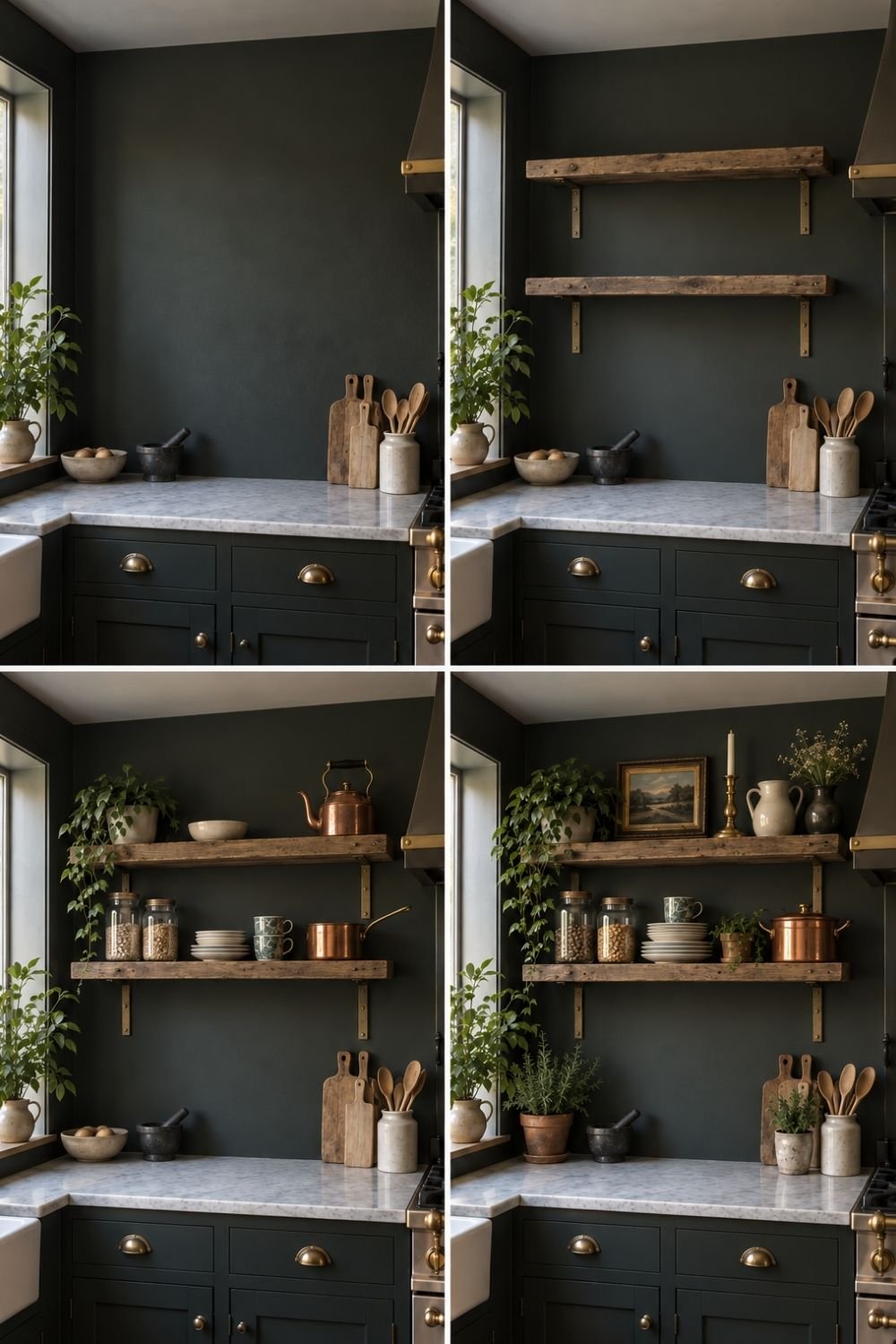
Photo by OurHoneyHome
The four frames above build one wall step by step. It begins as a bare stretch of dark green wall above a marble counter, with a few boards and a crock of wooden spoons already there. Two chunky reclaimed beams go up on black brackets. Then the shelves fill with what gets used: glass jars of beans and grains, a stack of plates, patterned mugs, a copper saucepan, a white bowl and a copper kettle, with a trailing plant at one end. In the last frame the top shelf gains a small framed landscape, a brass candlestick, a stoneware jug and a vase of dried flowers, and a pot of rosemary appears on the counter.
That last step is the one to copy. The shelves are still holding jars and plates, but adding one picture, one candlestick and something growing turns the wall from utilitarian into something that looks like it belongs to a person. Heavy shelves on visible brackets also suit this look better than floating ones, since the bracket is part of the charm.
Light is the whole trick
I’d argue lighting matters more here than anything else on this list. A dark kitchen with a single ceiling fixture is grim at four in the afternoon; the same kitchen with four small warm light sources is the reason people fall for this style in the first place.
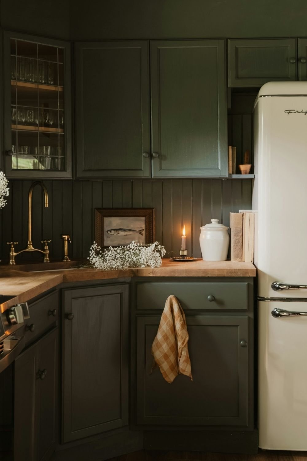
Photo by Clay Banks on Unsplash
The corner above shows what that looks like in practice. Dark green cabinets, one with leaded glass doors, run above a dark green beadboard backsplash and a butcher block counter, with a cream retro fridge on the right and an unlacquered brass tap on the left. The only light in the frame is a single taper candle on a small brass dish, and it’s enough to pick out a white ceramic crock, a stack of old paperbacks, a tiny framed fish painting and a spray of white gypsophila lying on the counter. A gingham towel hangs from a drawer.
In a working kitchen you need more than one candle, obviously, so the layers I’d plan for are light on the counter where you actually chop, something glowing at eye level like a wall light or a small lamp, and one low warm thing in the evening, whether that’s a candle or a tiny table lamp on the counter. Warm bulbs in the 2200 to 2700K range flatter this palette; anything cooler turns the greens gray and makes the wood look orange.
The grandma part: the objects
Paint and shelves get you a dark kitchen. Objects get you the grandma core kitchen underneath it. This is the part that can’t be bought in one trip, and I think that’s a feature rather than a problem.
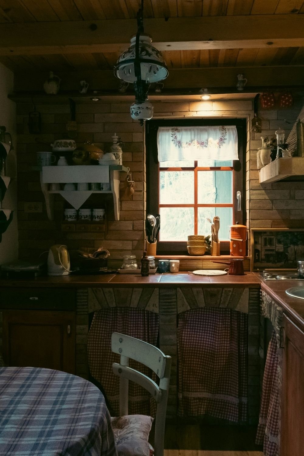
Photo by Faris Mohammed on Unsplash
This rustic kitchen has almost nothing in common with a magazine shoot, and it’s the most convincing room in this post. Brick walls and a plank ceiling, an ornate glass pendant on a chain, a painted wall shelf holding jugs and cups, an embroidered half curtain at the small window, a checked tablecloth on the table, gingham skirts hiding the storage under the counter, and a windowsill crowded with a wooden bowl, a spoon jar and an orange coffee pot. Every single thing in it is there because someone uses it.
If you’re building this from scratch, secondhand is the whole game. Enamel jugs, old mixing bowls, a wooden bread board with a worn edge, mismatched cups, a cast iron pan, a framed print with a gold-brown palette, a linen tea towel. Flea markets, charity shops and family cupboards beat any shop that sells “farmhouse style” new, because the point is wear, and wear can’t be bought fresh. The grandmacore kitchen post covers the lighter end of the same idea if you want both.
The table, where it all comes together
In a lot of these kitchens the table is the whole reason the room exists, and it’s also the easiest place to see whether the look is working.
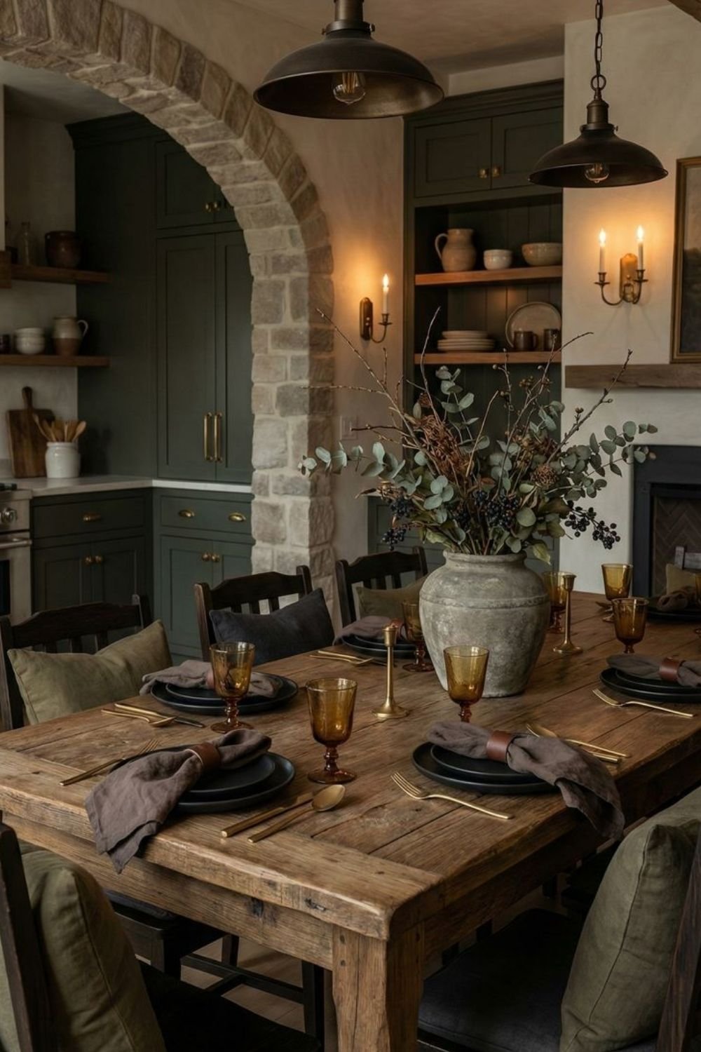
Photo by OurHoneyHome
The dining end above sits under a stone arch that leads through to a green kitchen. A long, heavily grained wood table carries matte black plates, brown glass goblets, brass cutlery, taupe linen napkins in leather rings and a stone urn filled with eucalyptus, dried seed heads and dark berries. Two aged bronze pendants hang low over the table, a pair of candles burn in a brass wall sconce, and the chairs are dressed with olive and charcoal linen cushions.
The thing to notice is how few colors are involved: green, brown, black, brass and one amber accent in the glassware. A dark cottagecore kitchen is easier to pull off with a tight palette than with a broad one, because the shadows are doing half the work and every extra color competes with them.
A more urban take
Not everyone has a stone wall or a beamed ceiling, and this look doesn’t actually depend on either.
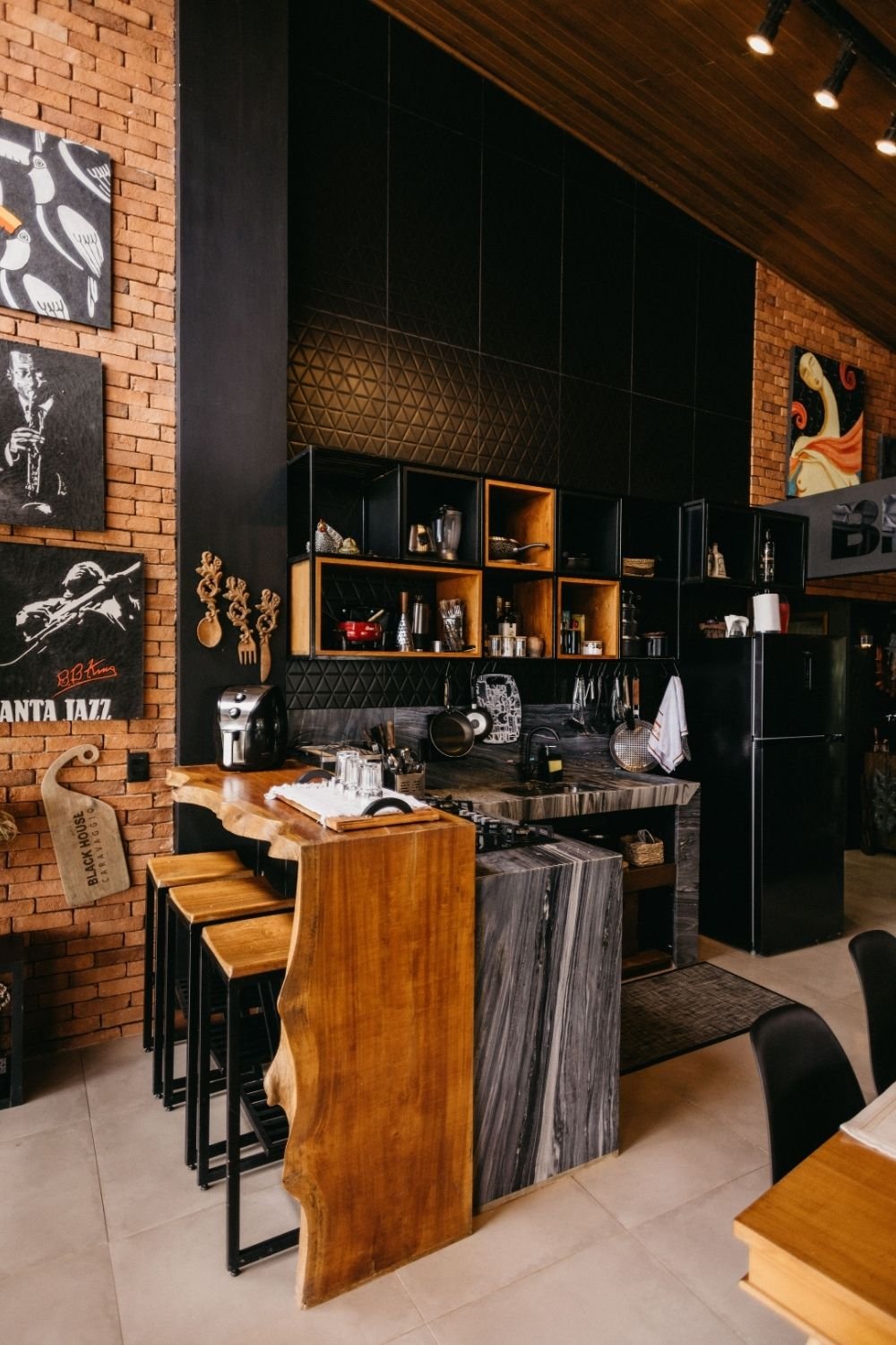
Photo by Jonathan Borba on Pexels
The kitchen above is the city cousin. Black textured tiles and black box shelving run up a tall wall between two panels of exposed brick, with a dark marble counter, a live-edge wood bar top, wooden stools and a black fridge. The shelves hold bottles, jars, a stack of pans and a few pieces of art rather than porcelain, and the wood is the only warm thing in the room, which is exactly why it reads as warm at all.
That’s a useful lesson for a flat with plain walls: keep the dark surfaces matte, put one big piece of honest wood into the room, and hang a few personal things rather than a matched set. The result lands somewhere between rustic and industrial, which is a perfectly good place to be. If the black-wall idea appeals, the black accent wall post goes into how to keep it from shrinking the room.
If you’re renting, or your kitchen is tiny
Almost none of this needs permission. Swapping the bulbs for warm ones, adding a small lamp on the counter and lighting a candle in the evening changes the mood of a kitchen more than any amount of decorating, and it costs about as much as a takeaway.
After that, it’s textiles and objects: a checked or linen tablecloth, a tea towel hanging from the oven handle, a gingham curtain on a tension rod under the sink instead of a cupboard door, a runner on the floor. Then the crockery and the wooden boards, which live on the counter anyway. Peel-and-stick options exist for backsplashes and even for cabinet fronts, and while I’d rather see proper paint on doors you own, a dark vinyl in a rental is a reasonable trade for a year or two.
In a small kitchen I’d go dark on the lower cabinets only, keep the upper wall pale, and use the shelf-plus-objects approach on one wall rather than all of them. That keeps the depth without losing the light, and the room still feels like a cozy vintage kitchen rather than a cupboard. For a brighter route to the same warmth, the colorful kitchen post does it with color instead of shadow.
Why this one ages well
The reason I keep coming back to this style is that it isn’t a period reconstruction. Nobody is pretending the year is 1954. It’s a kitchen that admits it gets used: the counter has marks on it, the shelves hold the jars you actually reach for, the pan on the hob is the one your family has always had, and the light is set low because that’s when the room is at its best.
That’s also why it doesn’t date quickly. Trends move through white kitchens fast because everything in them is new at once. A kitchen built from worn wood, old brass, a few good pots and a deep color has already survived one round of fashion, and it’ll survive the next one without you having to do anything at all.
