Almost nobody chooses a white kitchen. You inherit one. It came with the flat, or it was the safe option at the showroom, or it was what the last owner installed in 2015 because everything was white in 2015. Either way you end up with a room that’s perfectly fine and completely silent.
Adding color to it is easier than people think, but the order matters. My view is that you shouldn’t start with the cabinets, however tempting that is. Start with whatever you could undo on a Sunday afternoon, live with it for a month, and only then reach for the paintbrush. Most colorful kitchen ideas fail not because the color was wrong, but because six different colors arrived at once with no plan behind them.
Start where you can undo it
Accessories first. Not because they’re the biggest change, but because they tell you which colors you’ll still like in February.
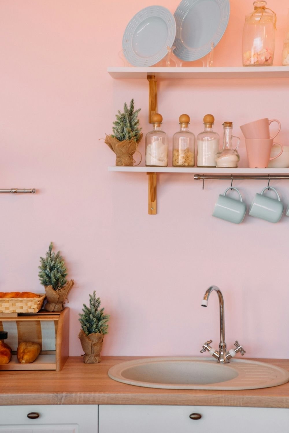
Photo by Eugenia Pan’kiv on Unsplash
The kitchen above is white cabinets and a wood counter, which is as ordinary as it gets. The color comes from a soft pink wall and then from things you could carry home in one bag: stacked pink mugs, sage green cups hanging from a rail, glass jars with wooden lids and a few small potted firs. Two white shelves hold all of it. Nothing is permanent, and the room still has a clear palette.
That’s the move I’d copy. Pick two colors, buy mugs, a tea towel, a couple of storage jars and one bowl in them, and put them where they’re visible: on a rail, an open shelf, or grouped on the counter. If the palette still pleases you a month later, it’s worth painting something.
The wall is the cheapest big change
A wall costs a tin of paint and a Saturday, and unlike cabinets you can repaint it when you get bored.
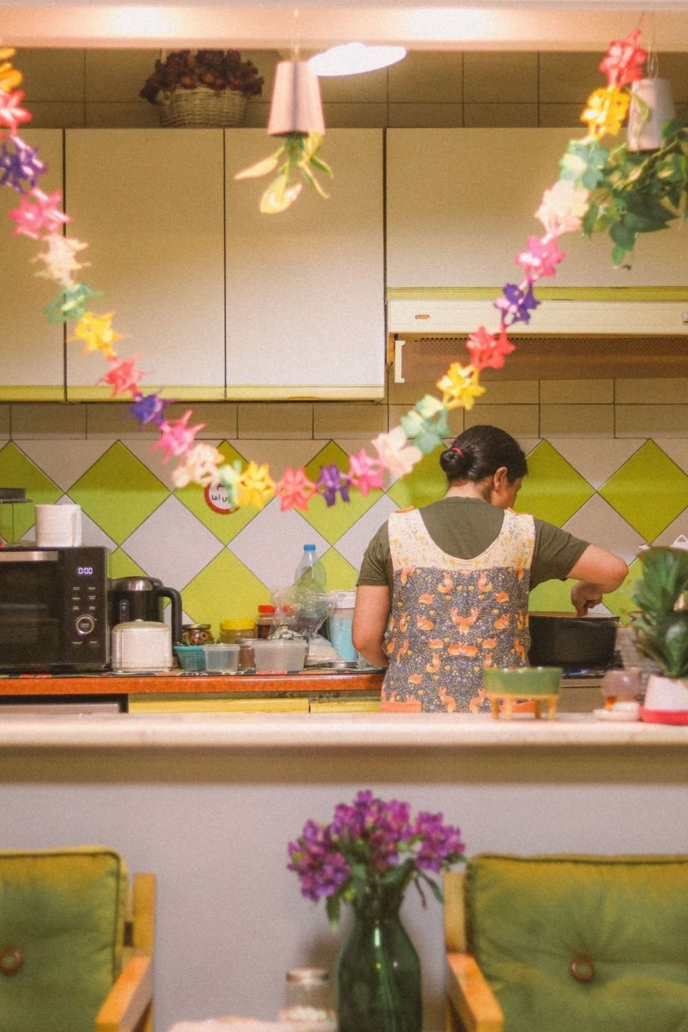
Photo by Golboo Maghooli on Pexels
This one gets its color from a lime and white diamond tile band running along the backsplash, with cream cabinets above and below it and a paper flower garland strung across the room while someone cooks at the hob. It’s a small, busy, thoroughly used kitchen, and the color sits in two places only: the tile band and the garland. Everything else stays pale.
For painted walls in a kitchen, I’d choose a color with some depth rather than a pastel, because cooking light is warm and yellow in the evenings and it washes pale colors out. Deep green, ochre, terracotta and a grayish blue all hold up well. Use a wipeable finish, and if the wall behind the hob is involved, tile or glass is a better idea than paint.
Where the color goes matters as much as which one it is. Most kitchen color ideas work best on the wall you see from the doorway or from the sofa, rather than on every wall in the room. Painting the short wall at the end of a galley, or the strip above the wall units, gives you the effect for a quarter of the paint and leaves the rest of the room bright.
Tile is where the personality lives
If you only make one permanent change, make it the backsplash. It’s a small area, it’s in the eyeline constantly, and it’s the one surface where a pattern doesn’t overwhelm a room.
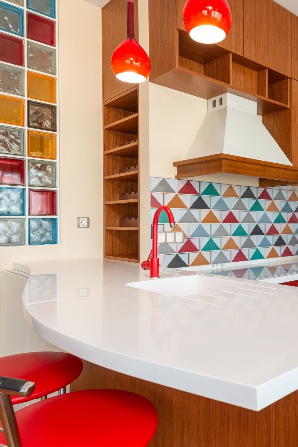
Photo by Max Vakhtbovych on Pexels
Here the backsplash is a grid of triangle tiles in teal, red, mustard, gray and white, set against warm teak cabinets, a white worktop and a curved white breakfast bar. Two red glass pendants and a red tap pick one color out of the tile and repeat it, and the colored glass block wall on the left does it again. That repetition is what stops a patterned backsplash from looking like an accident: one color from the tile gets echoed two or three times elsewhere.
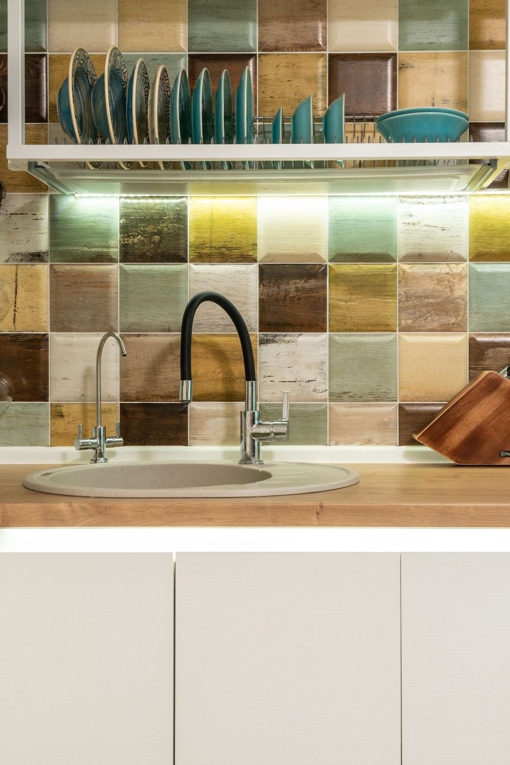
Photo by Max Vakhtbovych on Pexels
A gentler version is above: square tiles in mixed muted tones, greens, sand, rust and brown, each one slightly different, behind a wood counter with cream cabinets below and a plate rack above. The color range is narrow and earthy, so the wall reads as texture rather than pattern. Teal plates in the rack tie into the green tiles.
Two practical notes. Grout color changes everything, and a warm gray hides more than white ever will. And if you’re tiling only the backsplash, take it all the way to the underside of the wall units rather than stopping at 40 cm, since a half-height band of tile always looks unfinished.
Two-tone cabinets are the safest bold move
Painting all the cabinets is a big commitment. Painting half of them is a much easier decision, and it usually looks better.
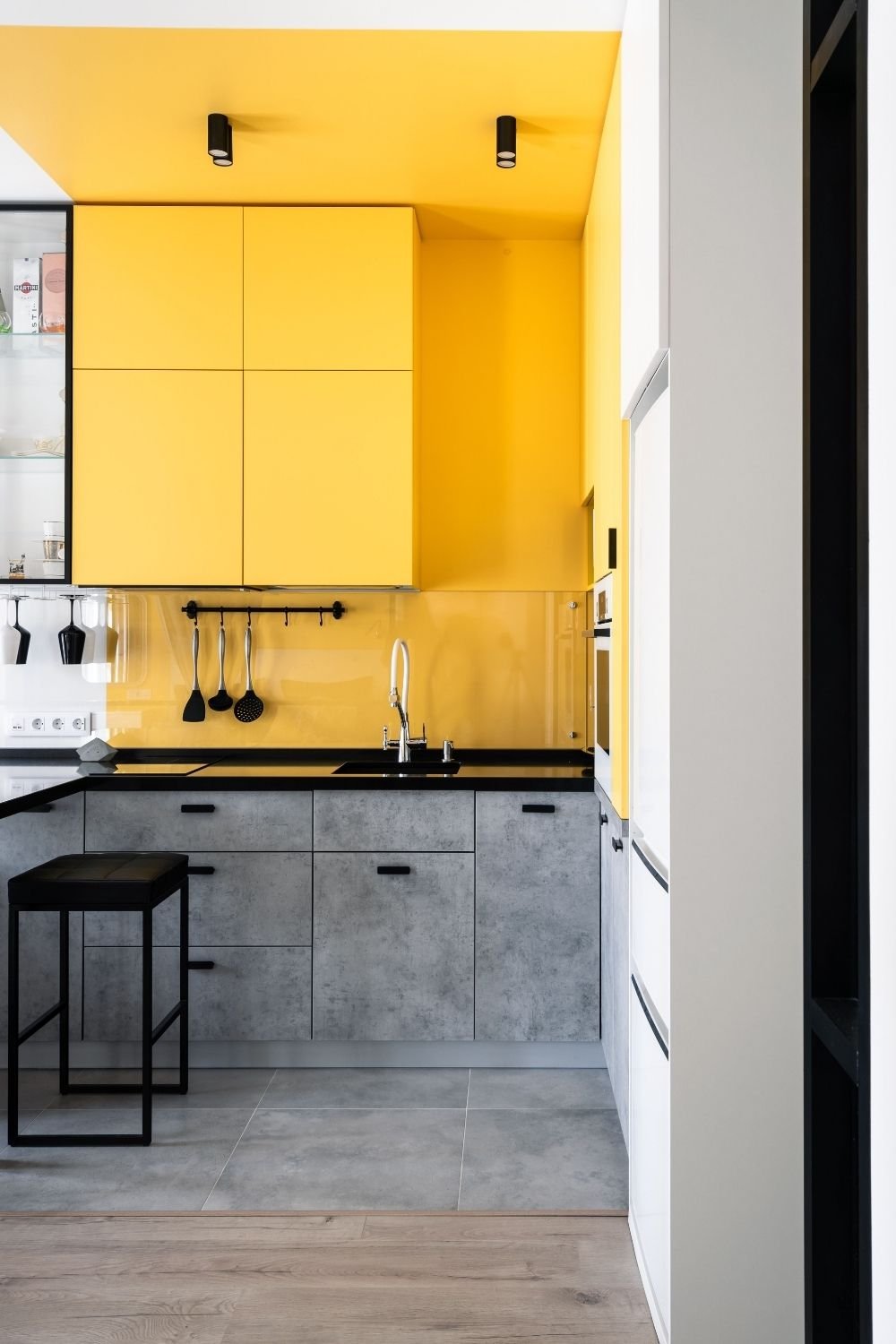
Photo by Sasha Pshenkov on Pexels
This small galley kitchen puts bright yellow on the upper cabinets, the ceiling above them and the glass backsplash, and keeps the base units in concrete gray with a black worktop. It’s a lot of yellow, and it works because the color sits entirely in the upper half, where there’s nothing else competing, and because gray and black are as neutral as it gets.
The usual arrangement is the other way round, with color below and pale above, which keeps a small kitchen feeling taller. Either way the rule is the same: one half colored, one half quiet. Colorful kitchen cabinets in a sage green and cream pairing, or plum below and white above, are far easier to live with than a room where everything is the same strong color.
Going all in on one color
Sometimes half measures aren’t the point. A single saturated color across every cabinet is a completely different room, and it needs the rest of the space to stay simple.
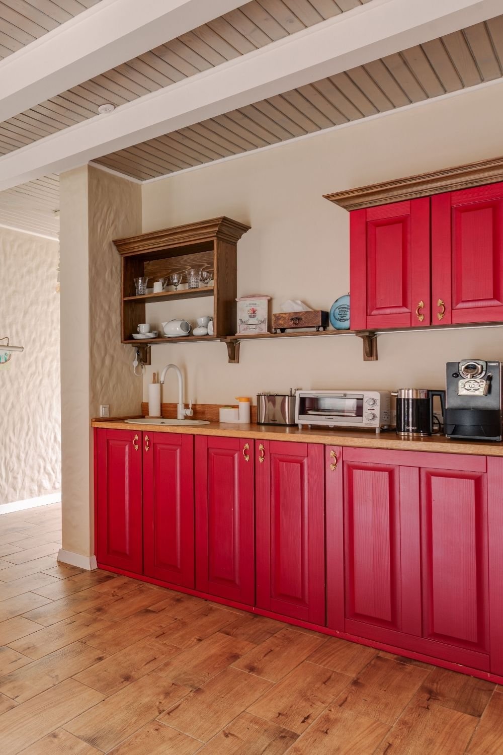
Photo by Max Vakhtbovych on Pexels
The kitchen above runs a whole wall of raspberry red panelled cabinets with brass handles under a wood worktop, with cream plaster walls, a white painted beam ceiling and a wood plank floor. An old wooden dresser shelf breaks the run of red. Nothing else in the room is colored at all, which is the only reason it doesn’t feel like a fairground.
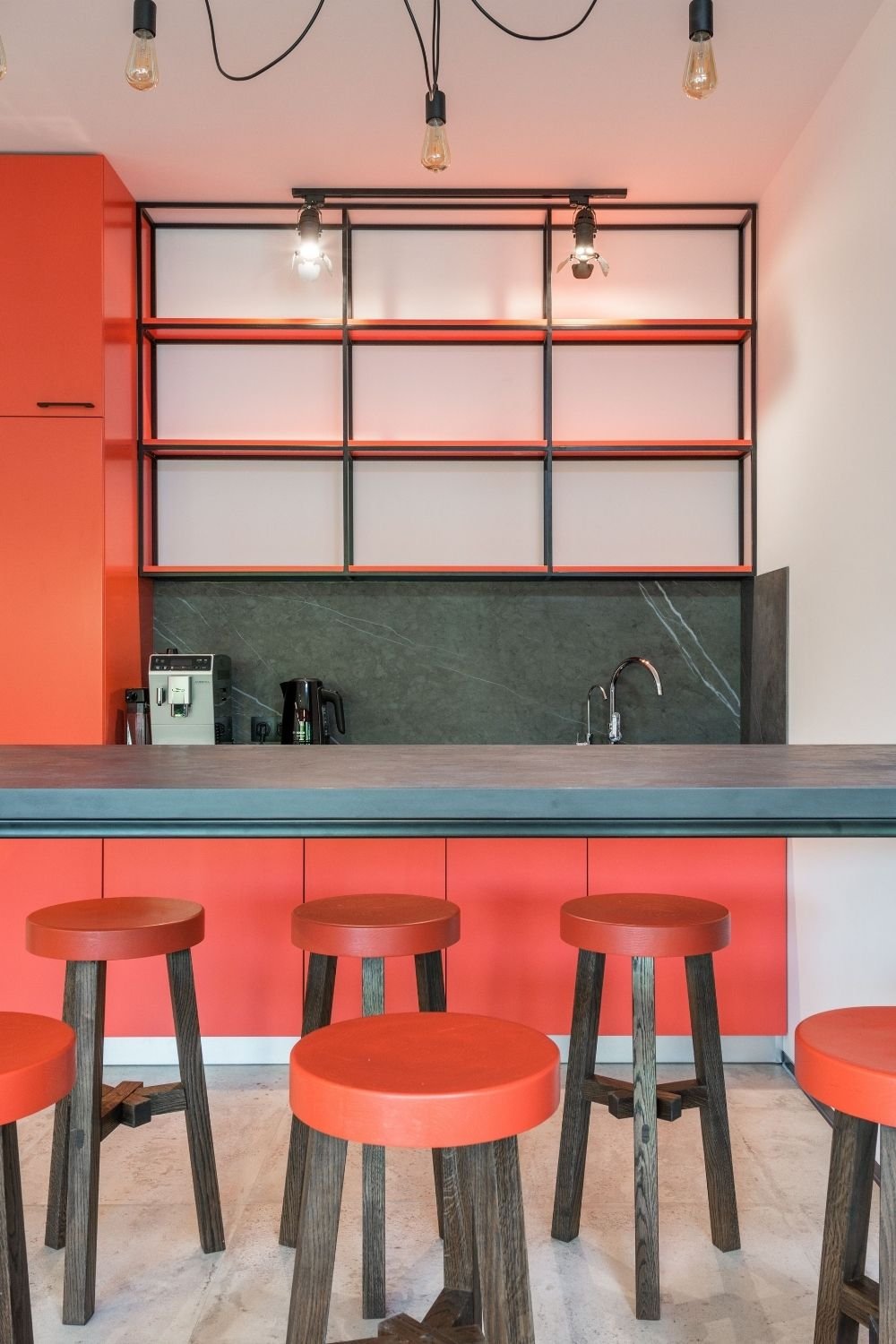
Photo by Max Vakhtbovych on Pexels
Here it’s coral, and the pairing is what makes it. Coral cabinets and a tall coral unit sit against a dark green marble backsplash, a gray stone worktop and open black metal shelving, with coral-topped stools on gray wood legs and bare bulbs overhead. Green and coral are opposite each other on the color wheel, which is why the room looks composed rather than loud: the strong color has something equally strong to push against.
If you go this route, keep the worktop, the floor and the walls neutral, and let the metal do the rest. A brass handle on a deep color reads as deliberate; a shiny chrome handle on the same door reads as a rental.
Blue, and the quieter end of bold
Not every colorful kitchen has to shout. Blue is the color most people land on when they want something clearly colored but calm.
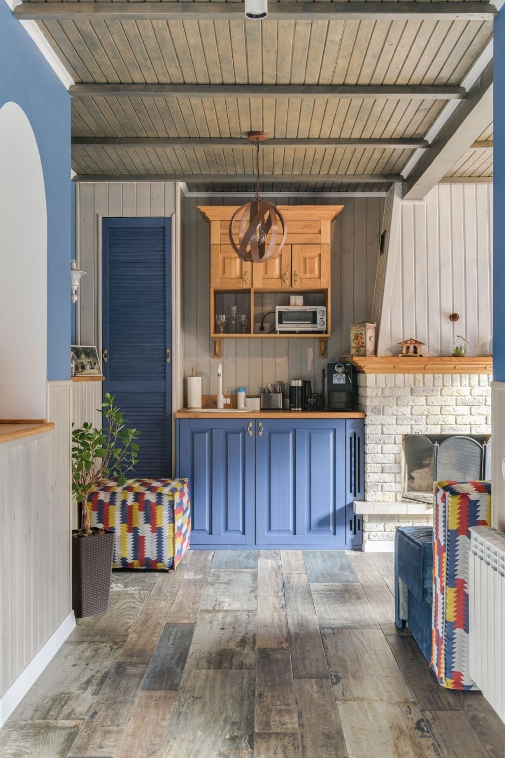
Photo by Max Vakhtbovych on Pexels
This kitchenette has cornflower blue panelled cabinets and a matching louvred door, set against gray tongue-and-groove walls, a beamed timber ceiling, a white painted brick fireplace and a rough wood floor. The color is repeated in the blue upper wall, and the only pattern comes from two kilim-print stools. A moody blue kitchen in a city flat works the same way: deep blue units, pale walls, wood or brass, and nothing else fighting for attention.
How to keep it from turning into a mess
One dominant color, one neutral, one material. That’s the whole formula, and almost every kitchen in this post follows it: red and cream and wood, yellow and gray and black, coral and green and metal.
White is the useful part people forget. It acts as a pause between colors, which is why a white worktop under colored cabinets makes the color look intentional, and why an entirely colored room needs pale walls. Pattern follows the same logic: one patterned surface per room. If the backsplash is patterned, the floor should be plain, and the textiles should pick colors out of the tile rather than adding new ones.
If you’re layering objects on the counter as well, the grouping trick from the countertop styling post keeps colored accessories from reading as clutter.
Renting, or not painting anything
Plenty of this works without touching the kitchen itself. Peel-and-stick tile stickers cover a plain white backsplash and come off with heat; the good ones look convincing from more than a metre away, which is as close as anyone stands to a backsplash. Cabinet handles unscrew in minutes, and a set of brass or colored knobs changes the character of flat doors more than the price suggests.
Beyond that, it’s the things you’d take with you anyway: a colored kettle, open shelves with colored crockery, a rug in front of the sink, a painting propped against the tiles, curtains instead of a blind. A vintage pink kitchen is easy to fake this way, since pink dishes and glassware are everywhere secondhand, and a sage green and cream kitchen needs little more than green crockery against existing cream doors. And if the kitchen is truly dire, a colored fridge or a painted freestanding cabinet gives you one strong piece without altering anything that belongs to the landlord.
Where you can’t easily go back
Accessories, textiles and handles are free moves. Paint on the walls is a weekend to undo. Cabinet paint is a long weekend and a lot of sanding, so it’s the point where I’d be sure, and I’d test the color on one door first, lived with for a week, in evening light as well as daylight.
Tile is the biggest commitment, since taking it off means replastering. That’s why I’d put the boldest pattern on the smallest area, usually the backsplash, and keep the floor quiet. If you want to go darker rather than brighter, the dark cottagecore kitchen post covers deep green and moody browns, and for painted pattern on walls instead of tile, the 70s wall designs post has ideas that cost a tin of paint and some tape.
