Think of your grandmother’s hallway. Orange wallpaper with a big repeating pattern, a wood-paneled wall in the living room, a swirl of brown and mustard somewhere in between. For about thirty years, everyone agreed that this was the worst thing that ever happened to a house, and it all got painted magnolia.
Now the same patterns are back on sale in wallpaper shops, and a wavy stripe mural is one of the most requested paint projects around. I find that funny, and also fair, because some of those retro wall designs were good ideas all along. They were just used everywhere at once.
So this is my list: the 70s walls I’d bring back today, how to do each one so it looks deliberate rather than dated, and the couple of things I’d leave in 1974. A retro accent wall is one of the cheapest ways to make a plain room feel like something, and most of these are a weekend of work with tape and two cans of paint.
The wavy stripe wall
If I could only bring back one, it would be this one. A wavy wall in earthy stripes looks like a sunset, takes up a whole wall, and costs almost nothing beyond paint.
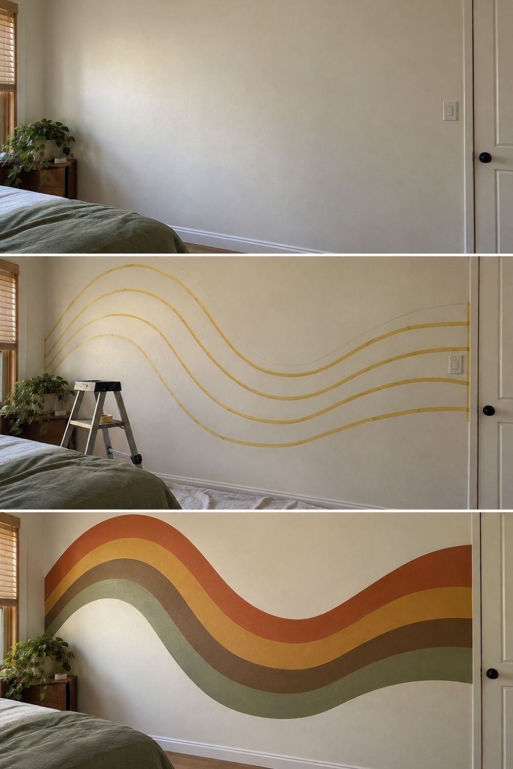
Photo by OurHoneyHome
The three frames above show one going up in a bedroom. It starts as a plain cream wall above a green bed. In the second frame, four wavy lines are marked out in tape, drawn as one long S-curve across the wall, with a small step ladder standing by. In the last, the bands are painted in rust, mustard, brown and olive, sweeping up on the left, dipping in the middle and rising again toward the door. The wall above and below stays cream, so the wave reads like a horizon line.
How to do it now:
- Draw the top curve first, lightly in pencil. A long, gentle S across the wall looks better than lots of small waves.
- Mark the other lines parallel to the first, measuring the same distance down at several points.
- Use flexible tape (thin, 1–2 cm masking tape bends around curves; wide tape doesn’t).
- Paint from the top band down, letting each color dry before taping the next.
- Peel the tape while the paint is slightly wet for the cleanest edge.
Keep the wave centered on the bed, sofa or desk, and let it run behind the furniture rather than floating in the middle of the wall.
Stacked arches
Arches were everywhere in the 70s, and painted arches are the easiest way to get that shape without building anything.
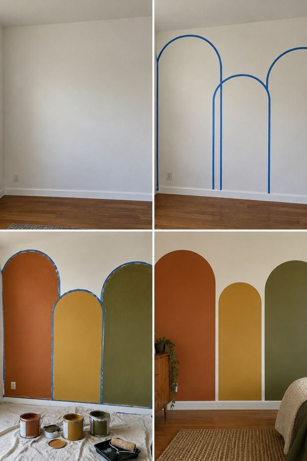
Photo by OurHoneyHome
The four frames above show the whole project. An empty white wall, then three arch shapes taped out at different heights, then the shapes filled in with rust, mustard and olive paint while the tape is still on, and finally the finished wall with a walnut dresser, a trailing plant and a bed with a jute rug in front of it.
How to do it now:
- Draw the arch with a string and a pencil. Pin the string at the center point of the arch, hold the pencil at the other end and swing it in a half circle. It’s the same trick as a compass, just bigger.
- Vary the heights. Three arches at the same height look like a fence. Different heights look intentional.
- Let them run to the floor, with no gap at the bottom.
- One color each, from the same family. Three unrelated colors turn into a playground.
This one works beautifully behind a bed, a desk or a console table, and it’s forgiving: the edges are curves, so small wobbles don’t show.
Bold vertical stripes
Stripes are the most wearable 70s pattern, because they read as graphic rather than nostalgic.
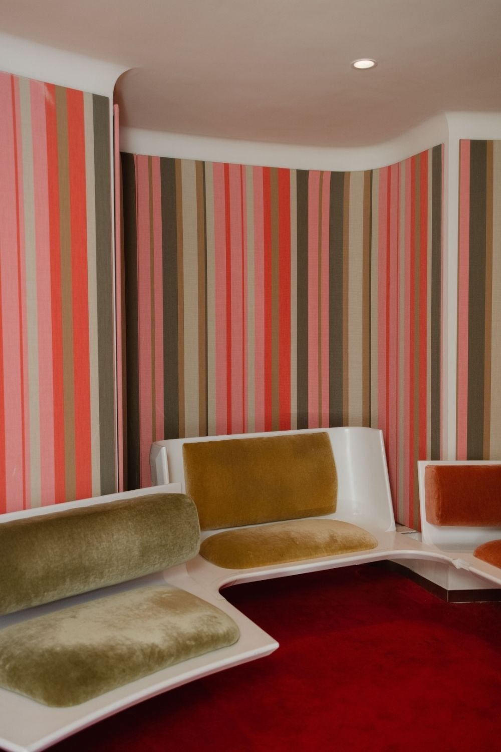
Photo by Josh Withers on Pexels
This room goes all in, and it’s a good example of how much personality stripes carry. Coral, pink, taupe and brown stripes of different widths run floor to ceiling around a curved corner, with a white ceiling and white trim. In front of them sit molded white benches with mustard, olive and orange velvet cushions on a deep red carpet. It’s unmistakably 70s, and the curved wall edges and white ceiling stop it from feeling like a tent.
How to do it now:
- Vary the widths. A 20 cm stripe next to a 5 cm stripe looks far better than all-equal bands.
- Keep one color neutral (cream, taupe, sand) so the eye has somewhere to rest.
- Vertical stripes raise a low ceiling; horizontal ones widen a narrow room.
- Use a level, not your eye. Walls are never as straight as they look.
For a quieter version, do stripes in two tones of the same color, or only on the lower half of the wall.
Big-pattern retro wallpaper
This is the one that most people picture when they think of 70s walls, and there’s a whole industry of reissued patterns now.
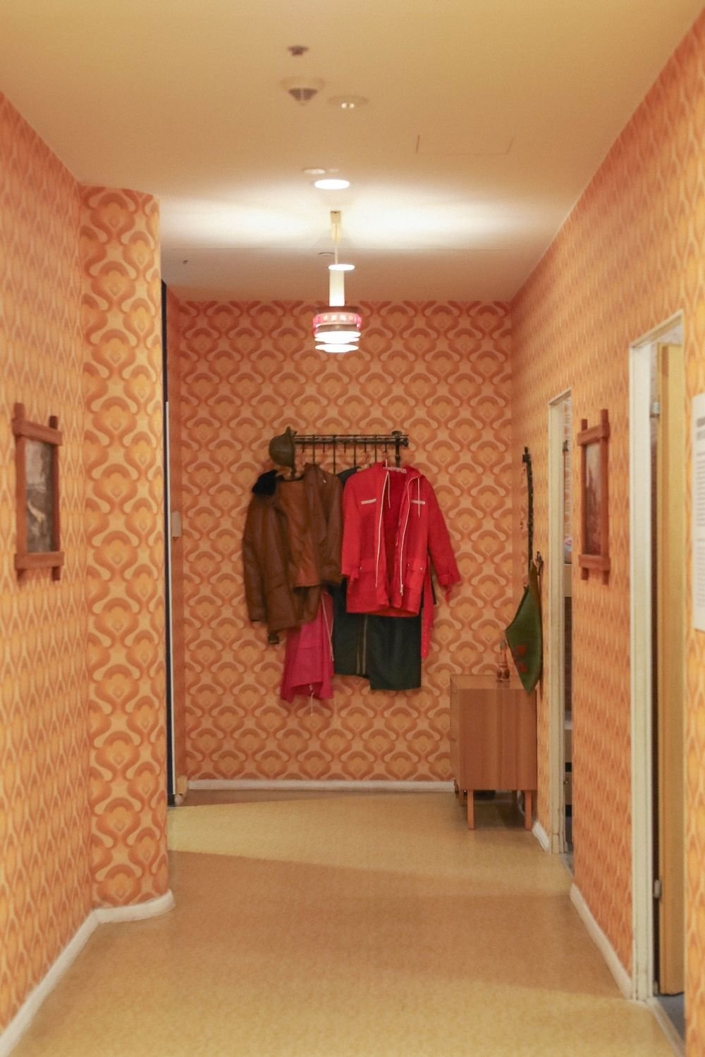
The hallway above is an original: orange and yellow wallpaper with a large teardrop pattern covering every wall, a pale yellow floor and ceiling, a row of coats on a black rail, small framed prints and a ceiling light with a red and chrome ring. It’s a full commitment, and in a short hallway with no furniture, that actually works.
In a room you spend hours in, I’d use the same pattern on one wall only.
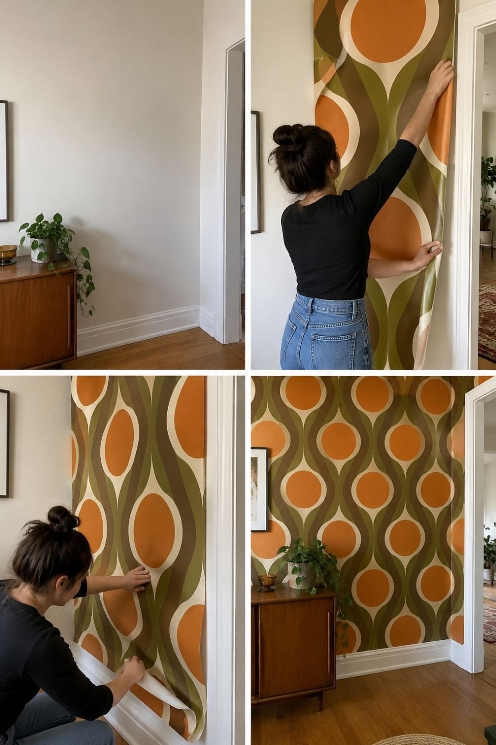
Photo by OurHoneyHome
The four frames above show peel-and-stick wallpaper going up on a narrow end wall next to a doorway. It starts as a plain wall beside a teak sideboard with a pothos on it. Then the first panel is smoothed on from the top, and the backing is peeled away as it goes down the wall. The finished wall is covered in a big orange, olive, brown and cream pattern of ovals and curved lines, framed neatly between the white door trim and the baseboard.
Why I’d pick peel-and-stick: it’s renter-friendly, it comes off without damaging the paint, and if you get tired of a loud pattern in two years, you’ve lost an afternoon rather than a wall.
A color-block mural
If wavy stripes feel too soft and arches too simple, color-blocking with rounded shapes is the most “graphic design studio, 1972” option there is.
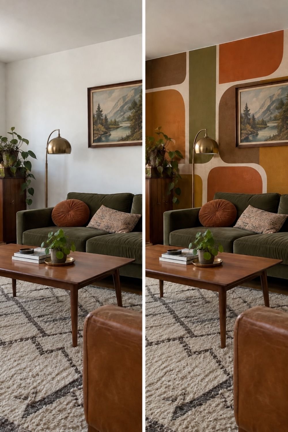
Photo by OurHoneyHome
The before-and-after above shows the same living room twice. On the left: a cream wall, an olive sofa with a round rust cushion, a brass arc lamp, a teak cabinet, a framed mountain painting and a berber rug. On the right, everything is identical except the wall, which is now a mural of rounded rectangles and soft curves in burnt orange, olive, brown, mustard and cream. The framed painting stays exactly where it was, and it suddenly looks like part of the design.
How to do it now:
- Sketch it on paper first, to scale. Big simple shapes, rounded corners, four or five colors maximum.
- Work light to dark. Paint the palest shapes first, then overlay the darker ones.
- Leave breathing room. Cream or sand areas between the blocks keep it from looking like a carpet sample.
- Plan around what stays on the wall. Art, sconces and shelves can sit inside the empty spaces, which makes the whole thing look designed.
Floral wallpaper, but just one wall
Not all 70s pattern is geometric. There’s a whole other side to it: small, dense florals in orange, gold and brown.
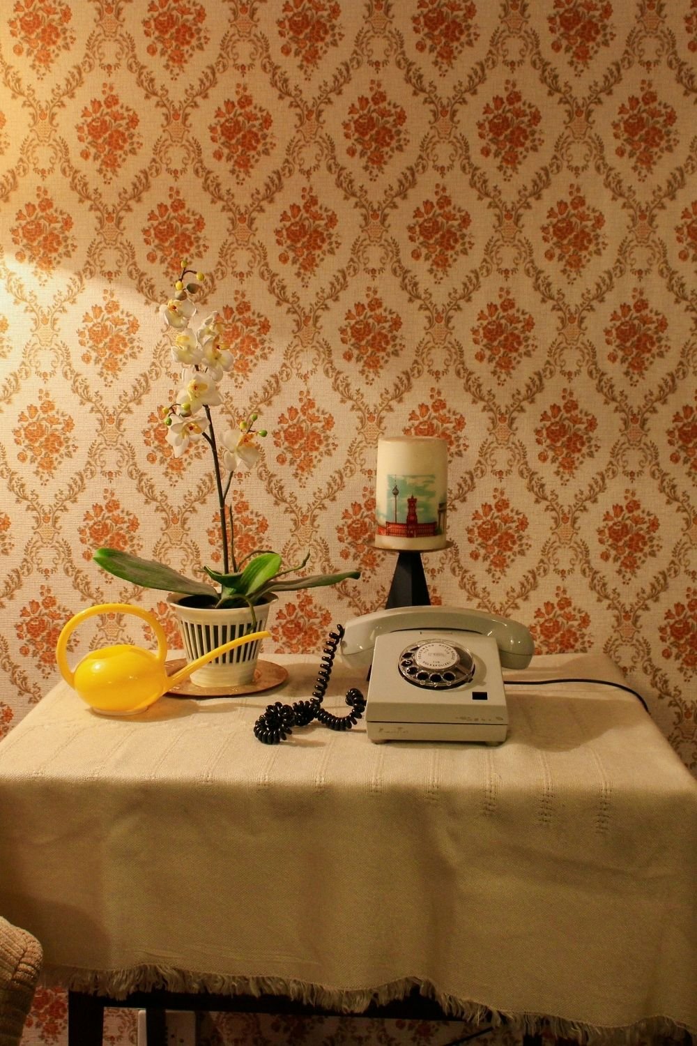
Photo by Sebastien LE DEROUT on Unsplash
In the photo, orange and gold damask-style floral wallpaper fills the wall behind a small table with a fringed cream cloth. On it: a white orchid in a ribbed pot, a yellow plastic watering can, a small printed lampshade and a pale green rotary telephone. It’s a museum-piece corner, but the wallpaper itself would look current in a downstairs bathroom or behind a bed.
The trick with dense florals is scale and restraint: one wall, plain textiles everywhere else, and a couple of period pieces rather than a whole roomful.
Wood paneling, in small doses
This is where I part ways with the decade. Full-height wood paneling on every wall makes a room dark and heavy, and no amount of good lighting fixes it.
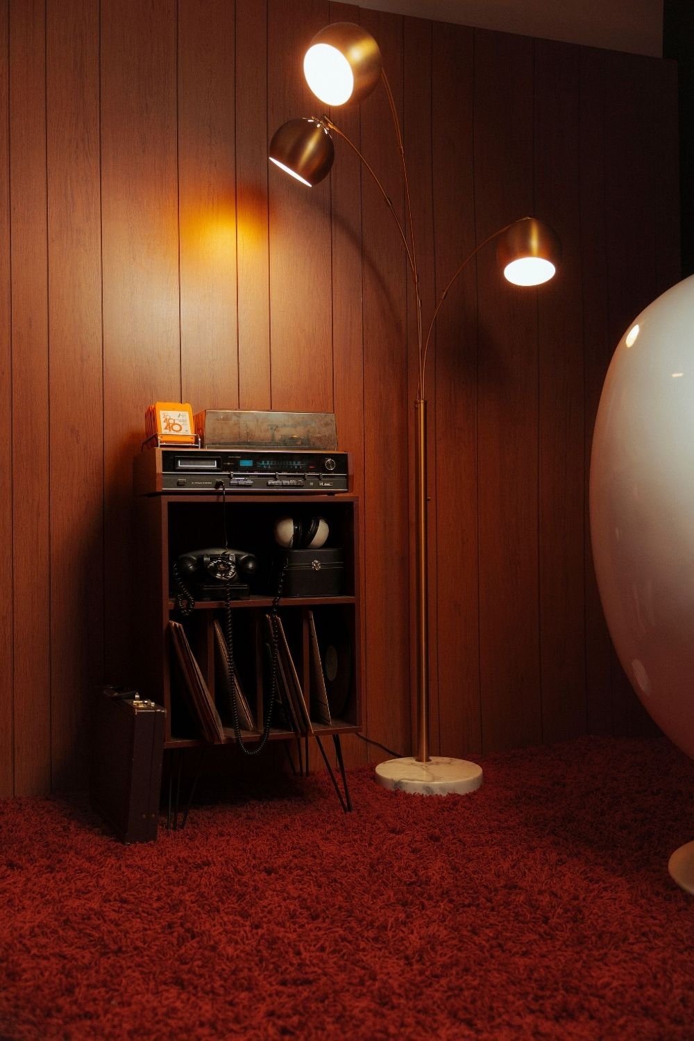
Photo by Sydney Sang on Pexels
That said, look how good this corner is. Warm wood paneling runs floor to ceiling, and in front of it stands a small record cabinet with hairpin legs holding a vintage receiver, a stack of records, a black rotary phone and headphones. A brass three-arm arc lamp leans over a deep red shag carpet, and the curve of a big white egg chair fills the right side. Lit by three warm pools of light, it’s the coziest corner in this whole post.
How I’d do it now: paneling on one wall, or inside an alcove, behind the TV or behind the bed. Vertical slats on a batten frame are the current version and much lighter in feel. Keep the other walls pale, the floor light, and let the wood be the warm thing in a bright room.
What I’d leave in the 70s
- Pattern on every wall of the same room, plus the ceiling. One wall is a feature; four are a headache.
- Dark paneling plus dark carpet plus heavy curtains. That combination is why everyone painted over it.
- Matching wallpaper and curtains in the same busy print.
- Popcorn ceilings. Nobody is bringing those back.
The palette
The colors are half the reason these walls work. Two directions to choose from:
- Earthy (the classic): burnt orange, mustard, chocolate brown, olive, terracotta, cream. Warm, forgiving and easy to live with. This is what’s in most of the photos above.
- Brighter (the update): coral, hot pink, tangerine, avocado green and cream. More disco than den, and best in a small room or a hallway where it’s a surprise.
Either way, the rule is the same: three to five colors, one of them neutral, and stick to it across the whole wall.
Styling it with furniture and lighting
A retro wall on its own can look like a mural in a rented office. What makes it a room:
- Warm wood furniture, especially teak or walnut with tapered or hairpin legs.
- Curved shapes: a round mirror, a kidney-shaped coffee table, a curved sofa, an egg chair.
- Velvet and corduroy in mustard, rust or olive.
- Globe and arc lamps, ideally in brass or chrome, and warm bulbs only.
- Plants, lots of them, hanging in macramé if you’re feeling brave.
- One or two truly old things from a flea market, which stop the room from looking like a themed set.
If you want to go darker instead of brighter, the black accent wall post covers a moodier kind of feature wall, and the boho living room post has more on layering rattan, plants and textiles, which sit very happily in front of a 70s wall.
Pick one wall, not four
The one rule the 70s forgot is the one that makes all of this work today: choose a single wall and let the rest of the room stay quiet. A wavy mural behind the bed, cream on the other three walls. Arches behind the desk, plain paint everywhere else. Wallpaper in the hallway, where you pass through rather than sit.
If you’re still nervous, start with the smallest wall in the house. A downstairs bathroom or the wall at the end of a hallway takes half a can of paint, and you’ll know within a week whether you want more of it. My guess is you will. For a gentler take on going bold with color, the soft color drenching post is the next thing I’d read.
