Color drenching gets presented as a single decision. You either paint the walls, the trim, the ceiling, the doors and the radiator in one shade, or you don’t do it at all.
That framing puts a lot of people off, and I think it’s wrong. In practice it’s a dial rather than a switch, and most of the rooms I find convincing stop about three quarters of the way along. You can get the enveloping quality without committing to a scheme you’d need a professional and a free week to undo.
The five levels, from cautious to committed
Everything in this post sits somewhere on this scale.
- Walls only, with the trim and ceiling left white
- Walls and trim, so skirting, architraves and window frames disappear into the wall
- Walls, trim and ceiling, which is where the room starts to feel enclosed
- Adding doors, radiators and built-in shelving in the same shade
- Adding cabinetry and some furniture, the full monochromatic version
Level two is the one I’d suggest to anyone nervous, because losing the white skirting does most of the work and costs one extra tin. Level three is where I’d stop in a bedroom. Level five belongs in a small room you pass through rather than a room you sit in all evening.
Level one done properly: one color, two strengths
Before adding surfaces, it’s worth knowing that drenching comes in two forms. Exact match uses one shade everywhere. Tonal uses the same color at different strengths, typically a lighter version overhead.
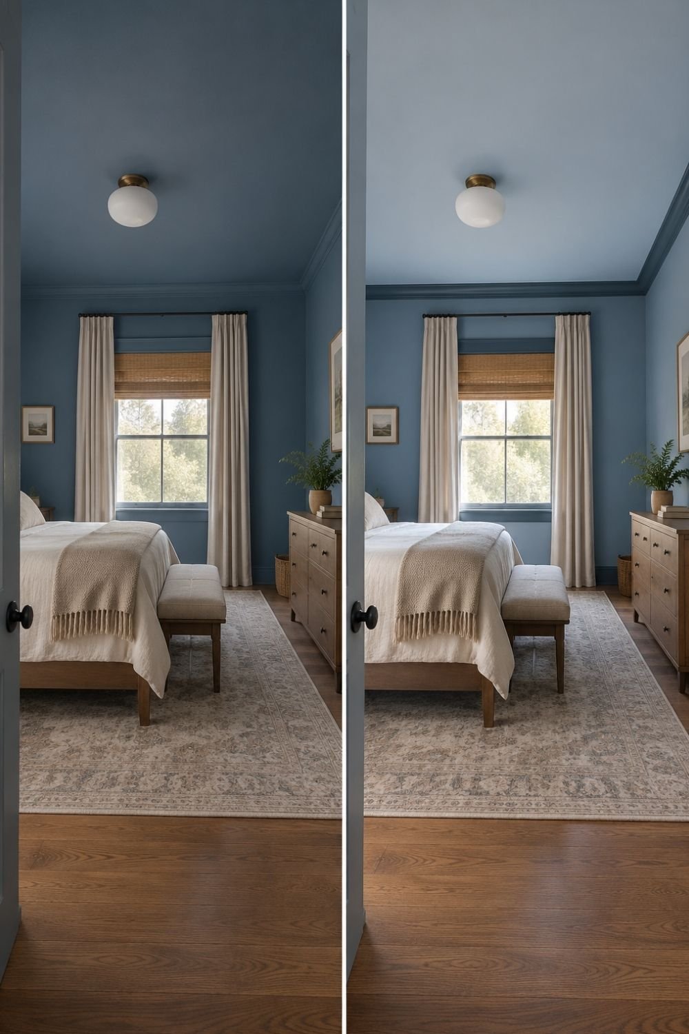
Photo by OurHoneyHome
The two halves above show the same blue bedroom both ways. On the left the ceiling carries the full-strength color, and the room reads lower, quieter and more like a cocoon. On the right the ceiling is the same blue diluted, and the room feels taller while still reading as one color.
Everything else is identical: cream curtains, a woven roman blind, an oak dresser, a faded rug, a brass globe fitting and dark painted trim.
If the ceiling is low or the room is north-facing, I’d take the right-hand option. Most paint brands will mix a shade at 50 percent strength, which gives you a lighter version guaranteed to share undertones with the original. Picking a separate pale blue off a chart almost never matches.
Where I’d stop in most rooms
Level three, with the ceiling included but the furniture left alone, is the version I’d recommend to nearly everyone.
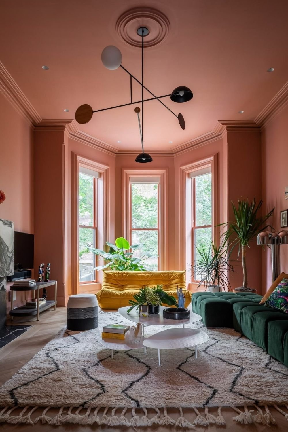
Photo by OurHoneyHome
This living room is peach on the walls, the ceiling, the cornice, the ceiling rose and every window architrave, and nothing else. The furniture argues with it happily: a yellow modular sofa in the bay, a deep green sectional opposite, a black and white mobile light fitting, a Beni Ourain rug and a lot of plants.
That’s what makes a color drenched room work rather than feel oppressive. The shell is one color, the contents are not. Paint everything including the sofa and it becomes a set.
Notice also how much detail the single color reveals. Picked out in white, that cornice and ceiling rose would shout. Painted over, they read as texture and shadow, which I find far more interesting.
The ceiling is the highest-impact half-measure
If you only have one weekend, the ceiling gives you more per liter than any other surface, and it doesn’t have to match the walls.
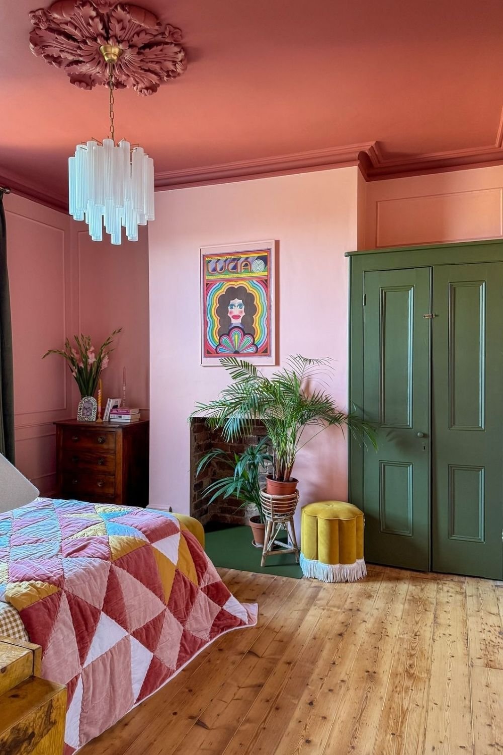
Photo by OurHoneyHome
This bedroom runs soft pink on the walls and panelling, a deeper terracotta across the ceiling, the ceiling rose and the cornice, and then a muted green on the fitted cupboard doors and a patch of green floor. A pleated glass chandelier, a patchwork velvet quilt, an antique chest and a yellow fringed pouf fill it out.
Three colors, and it still reads as drenched rather than mismatched, because the pink and terracotta share a warm base and the green sits opposite both of them.
A darker ceiling over lighter walls is the combination people expect least and it’s the one I’d try first in a room with high ceilings and not much natural light.
Palettes that forgive a mistake
Some color families are simply more tolerant of being spread across every surface.
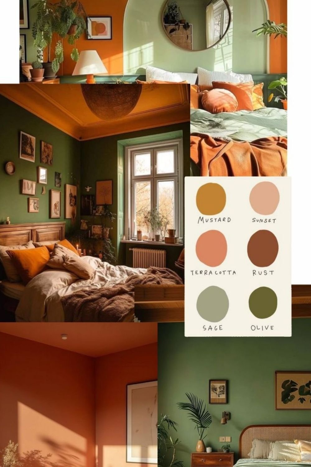
Photo by OurHoneyHome
The greens and earth tones above are the safest place to start. Olive walls under an orange ceiling, a sage bedroom with a terracotta ceiling, a full terracotta room, and a swatch card running mustard, sunset, terracotta, rust, sage and olive. All of these have yellow or brown in them, which means they stay warm under artificial light rather than going flat at six in the evening.
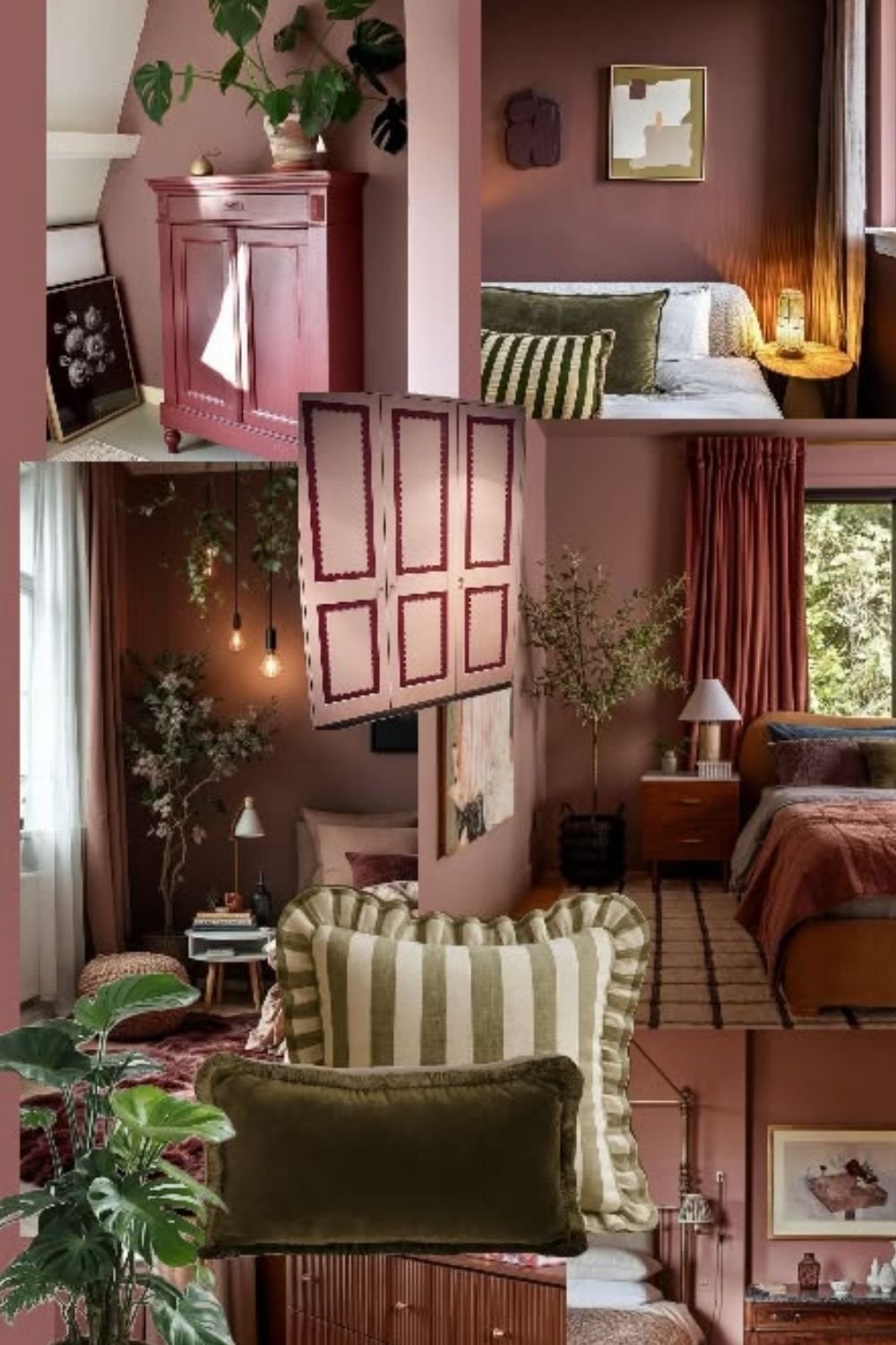
Photo by OurHoneyHome
Dusty pink and mauve are the other family I’d trust, and these are gentler than they look on a chart. Across these rooms the walls, ceilings and even a corner cupboard carry the same rosy brown, with olive and rust doing the accenting through cushions, curtains and a striped chair.
Pink of this kind photographs as a color and lives as a neutral, which is why it suits color drenching bedroom schemes so well. Blues and greens behave similarly. Anything with a lot of gray in it does not, and a drenched gray room is the one I’d talk somebody out of.
If you want contrast instead of tone
Drenching doesn’t have to mean one color. Two strong colors with the boundary placed somewhere deliberate produce the same enveloping effect by another route.
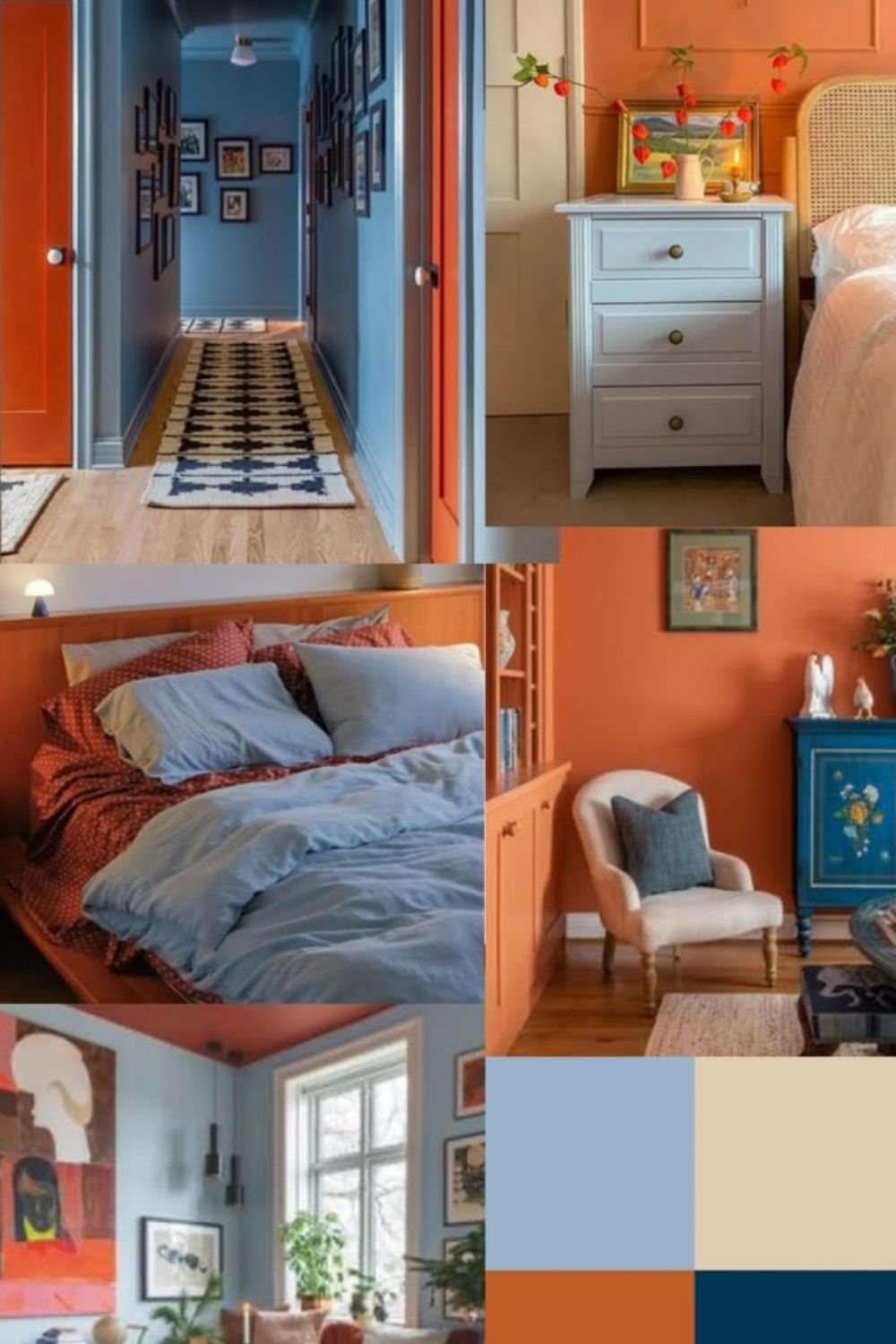
Photo by OurHoneyHome
Blue and orange is the pairing doing the work here. A blue hallway with orange doors and orange frames, an orange bedroom wall with a blue painted cabinet, an orange bed frame under blue bedding, and a blue-green room with a coral ceiling. Complementary colors at equal strength, and the hallway in particular is the clearest demonstration in this whole post.
Hallways are the ideal test case. They’re small, you don’t sit in them, and a strong scheme there makes the rooms opening off it feel calmer by comparison.
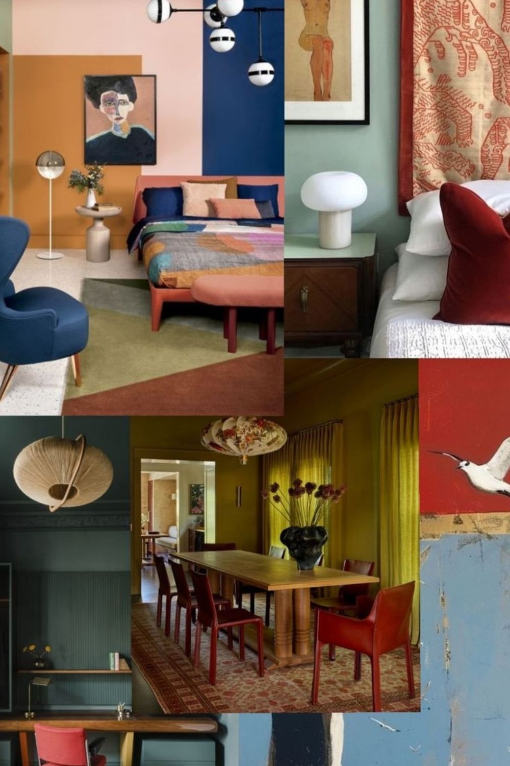
Photo by OurHoneyHome
Color blocking is the sharper version. A bedroom wall divided into apricot, pink and navy panels behind the bed. An olive dining room with yellow curtains and oxblood leather chairs. A teal panelled study with a red desk chair. A sage bedroom with a rust textile hung behind it.
The olive dining room is the one I’d actually live in. Walls, ceiling and curtains in one deep yellow-green, with the red chairs as the only interruption, which is close to how a jewel-toned deco scheme is built.
Finish, light and room size
Three practical points decide whether any of this works.
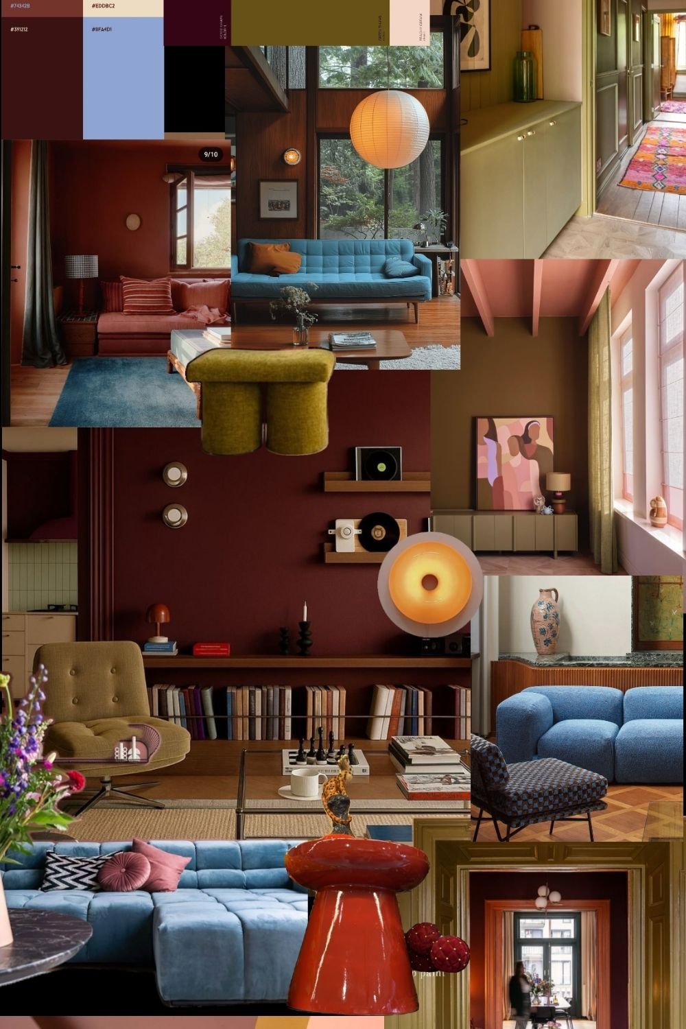
Photo by OurHoneyHome
Finish first. Every scheme on this board uses matte on the large surfaces, and the variation comes from what’s next to it: gloss on a cabinet front, velvet on a sofa, lacquer on a side table. Matte walls with an eggshell or satin trim in the identical color is the combination I’d default to, because you get a subtle edge where surfaces meet without a color change.
Light second. A drenched room changes character completely between midday and lamplight, so test a patch on two walls and look at it after dark before committing. North-facing rooms want the warmer end of whatever family you’ve chosen.
Size third, and this one is counterintuitive. Small rooms take drenching better than large ones, because no expanse of blank wall is left for the color to sit heavy on. A small bathroom or a hallway is the easiest win available. It’s the same reasoning behind treating a dark accent wall as a small-room move rather than a large-room one.
Kitchens and bathrooms deserve one extra note, because both have a large run of built-in units that counts as a surface whether you paint it or not. In a kitchen, taking the wall color onto the cabinet doors is level five by definition, and it works better on a small galley than on an open-plan room where the units run into a living area. In a bathroom, the equivalent move is painting the panelling, the vanity and the back of the door, and leaving the tile alone. Both benefit from a satin or eggshell finish on the joinery so it wipes clean, with matte kept to the walls above.
The renter version, and where I’d start
If painting isn’t an option at all, partial drenching still is. Full-length curtains in the wall color across an entire wall, a painted freestanding wardrobe or chest, a run of removable peel-and-stick panelling, or a folding screen behind the bed will each carry the idea. So will bedding, a rug and a lampshade in one family, which is the cheapest route to monochromatic room ideas that a landlord can’t object to.
If you can paint, the order I’d follow is trim first, then ceiling, then everything else if you still want more. Losing the white skirting is the single change that makes a room look considered, and it takes an afternoon.
Start in the smallest room in the house. Color drenching is far easier to judge once you’ve lived with it, and a hallway or a spare bedroom costs almost nothing to repaint if you turn out to hate it. If you like it, the rest of the bedroom directions worth saving will look different to you afterwards.
